

 Deutsch
 Español
 Français
 Hrvatski
 Italiano
 Polski
 Português (BR)
Creating Pie Charts
Overview
Create pie charts to visualise ticket statistics. This chart type is best used to show relative figures which could be the amount of tickets in percent.
For example, visualise how many tickets are currently in each status in percent.
Access & Permissions
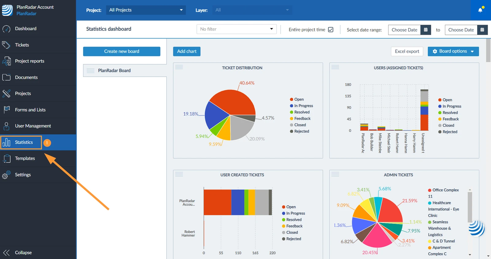
How to access Statistics
- Click Statistics

Create a Pie Chart
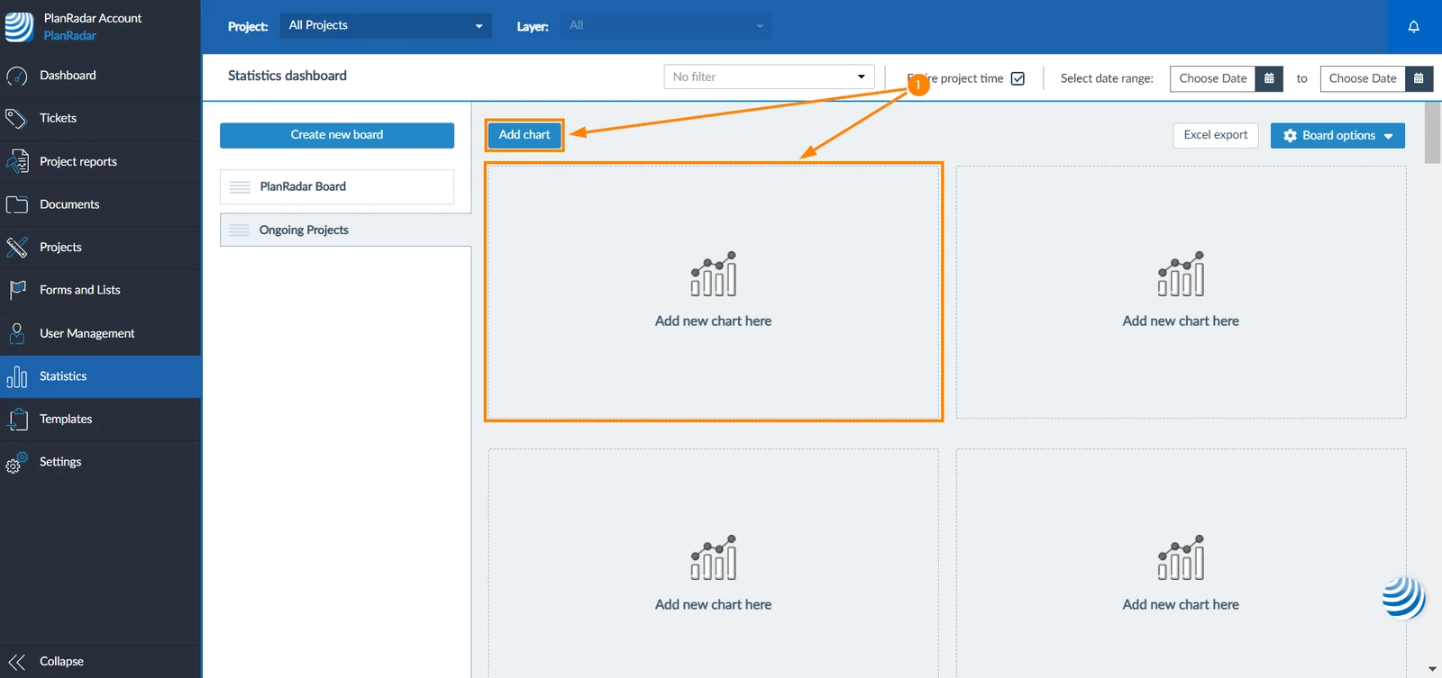
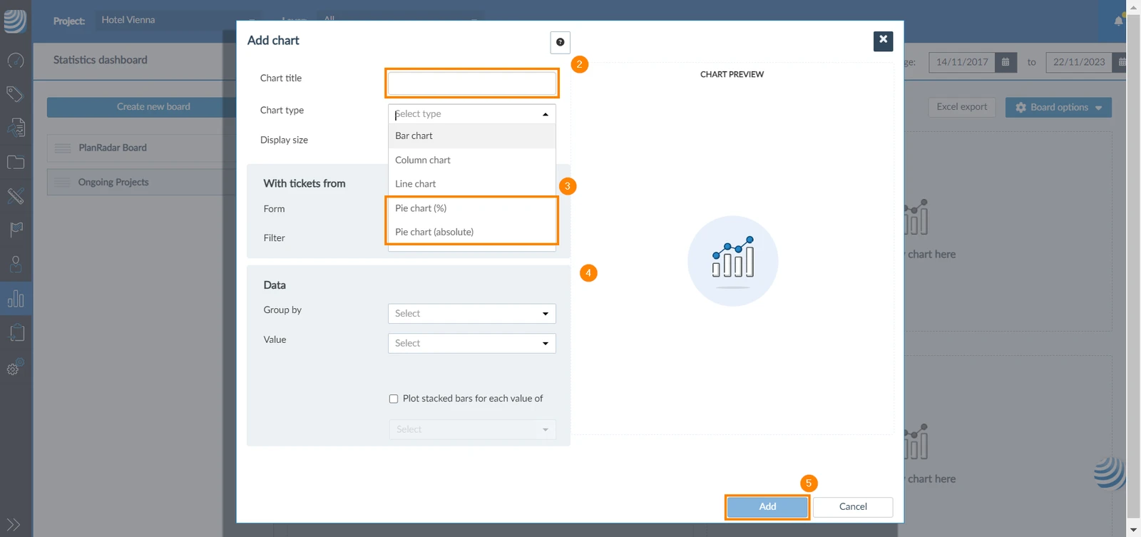
To create a pie chart:
-
Click Add chart or Add new chart here
-
Add a title to your chart
-
Select chart type to be Pie chart (%) or Pie chart (absolute)
-
Complete the chart based on the general guidance in Statistics.
-
Click Add
Related Articles
Updated December 4, 2024