

 Deutsch
 Español
 Français
 Hrvatski
 Italiano
 Polski
 Português (BR)
Creating Line Charts
Overview
Create line charts to visualise ticket statistics. This chart type is best used to show figures on continuous scales such as date and time and number fields.
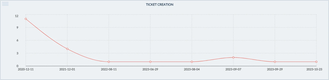
For example, visualise how many tickets have been created every day.
You can also use multi-line charts to add one more dimension: e.g. number of tickets created by day with a separate line per project.
Access & Permissions
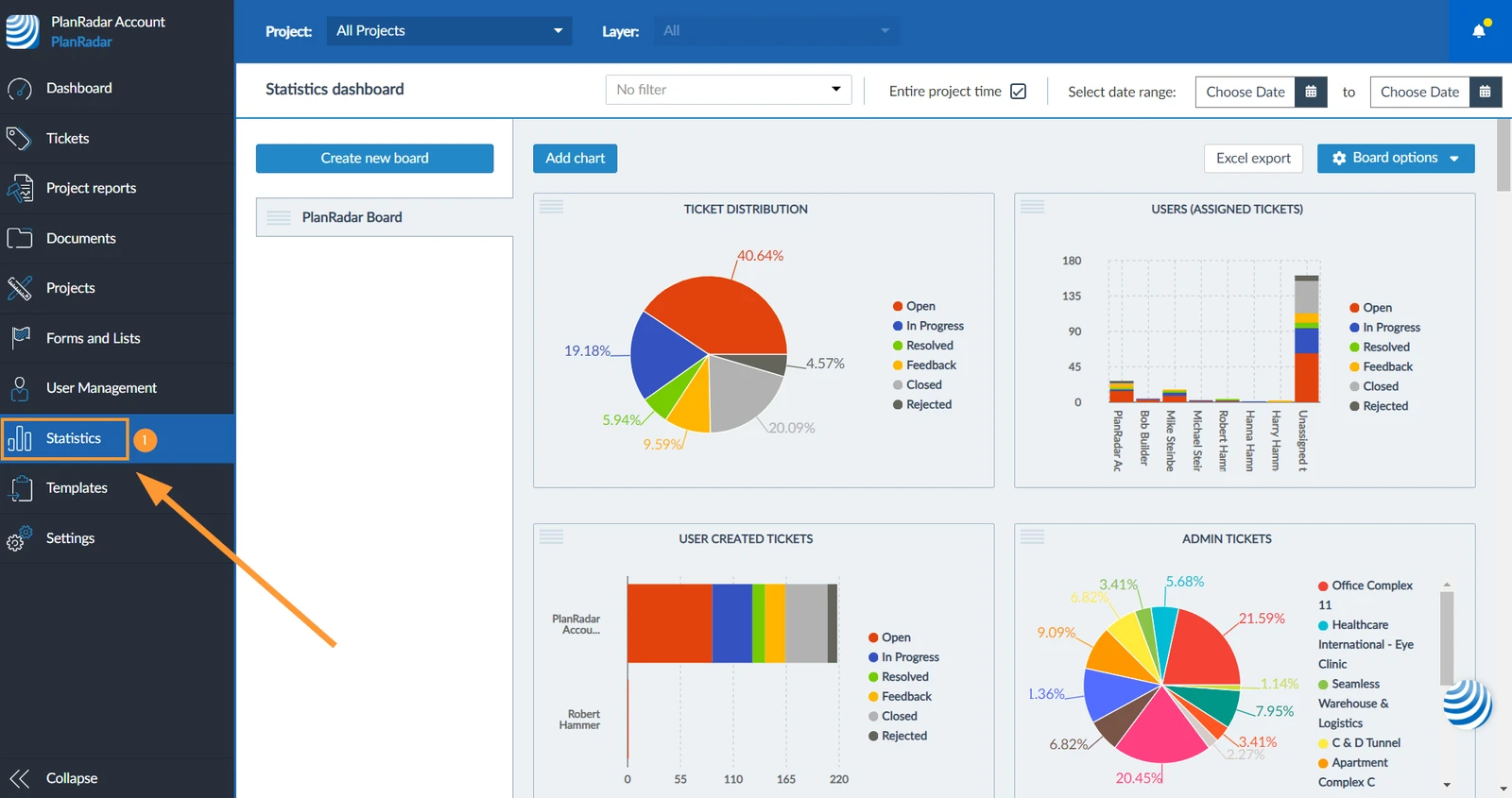
How to access Statistics
- Click Statistics

Create a Line Chart
To create a line chart:
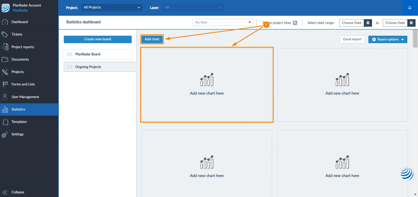
- Click Add chart or Add new chart here
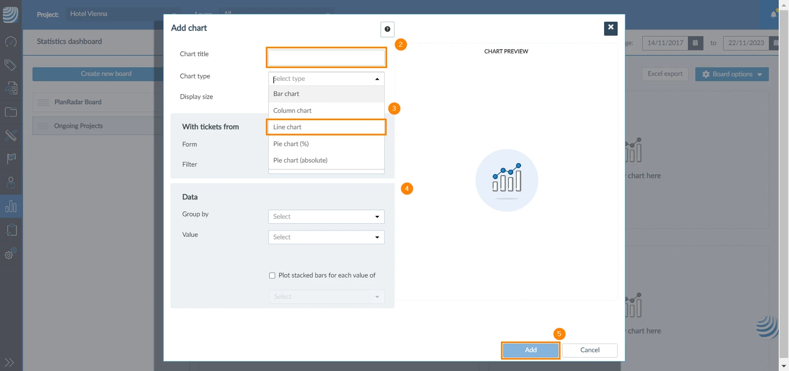
- Add a title to your chart
- Select chart type to be Line chart
- Complete the chart based on the general guidance in Statistics.
- Click Add
- The chart will appear in your board showing the data you specified (e.g. the number of tickets created every day)
Plot Multiple Lines
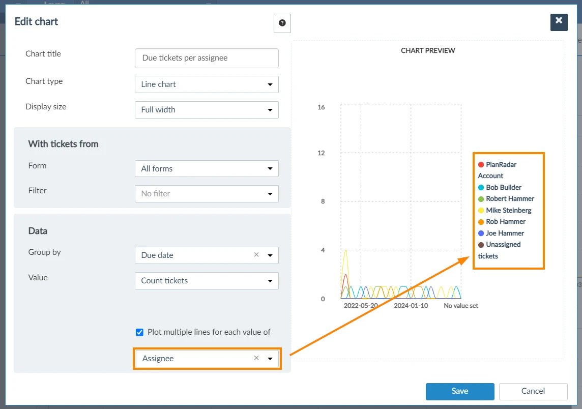
While creating a line chart, you can select to create a separate line for each value of an attribute you select; for example, you can select to show a line for each ticket assignee to represent their ticket due dates.
To do so:
- Select the Plot multiple lines for each value of checkbox
- Select an attribute from the drop-down
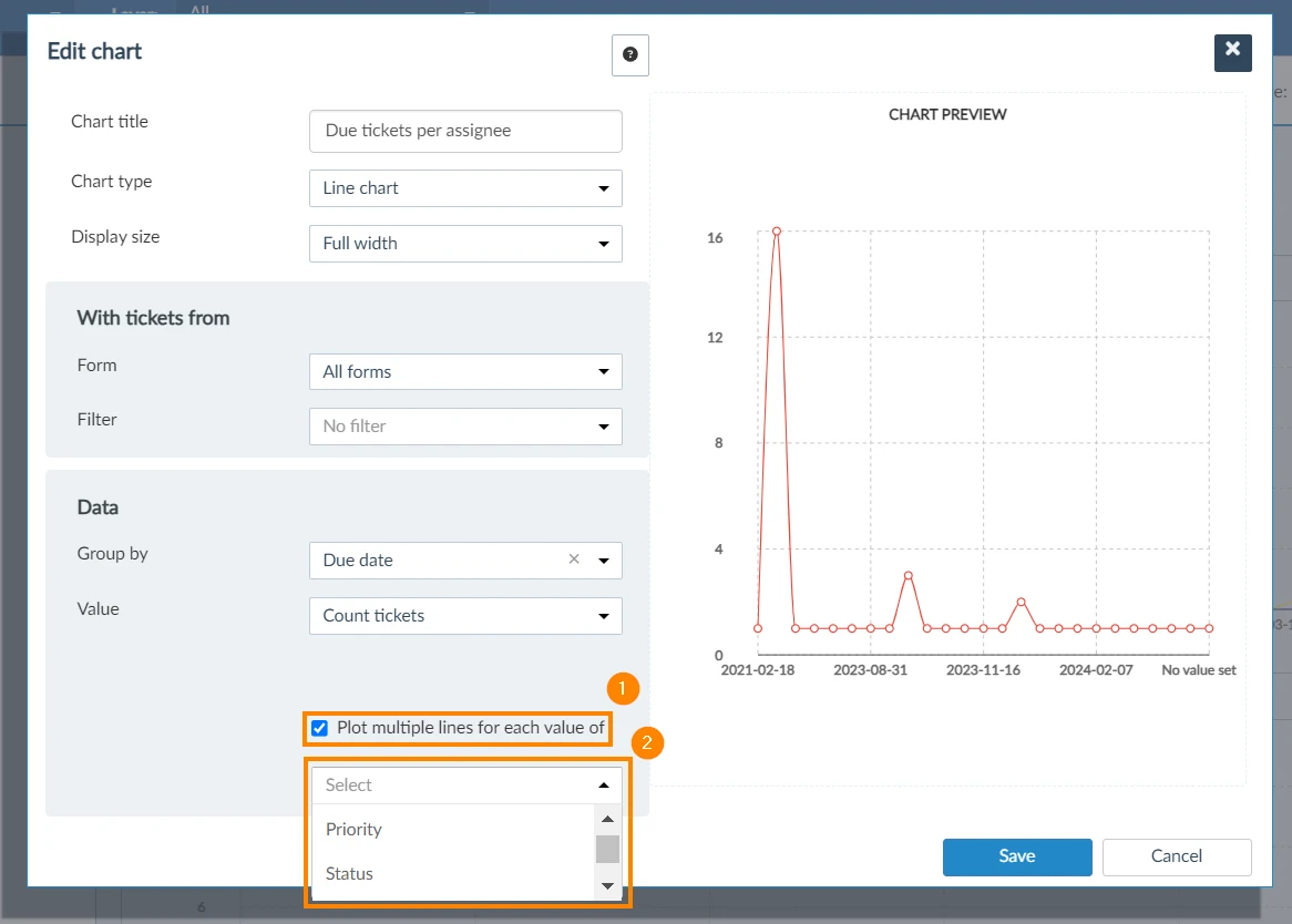
- The chart would then show multiple lines; each representing a single value of the attribute you selected
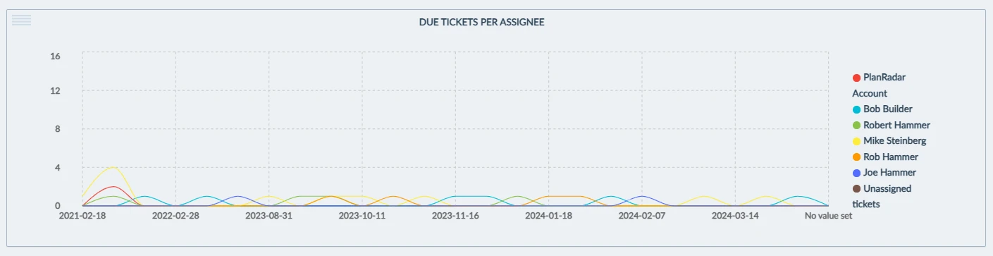
- In the resulted chart, you will see tickets due every day per assignee
Related Articles
Updated January 29, 2025