

 Deutsch
 Español
 Français
 Hrvatski
 Italiano
 Polski
 Português (BR)
Statistics
Overview
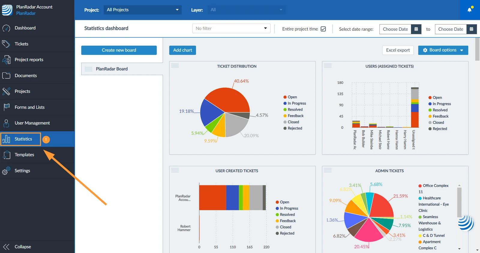
Create charts using data from your tickets to get insights into your projects. You can view these charts in the PlanRadar Webapp and filter by project, layer or a given time period.
You can export all data to PDF and Excel and even insert dynamic charts into ticket reports.
Access & Permissions
How to access Statistics
- Click Statistics
Boards
Boards act like pages to group your charts into separate dashboards. Each board has a title and can hold up to 10 charts with full page-width or 20 charts with half page-width.
Charts
A chart represents tickets data in various forms. You can define the chart type, which tickets you want to include (by form and optional filter selection) and from which ticket field(s) you want to visualise the data.
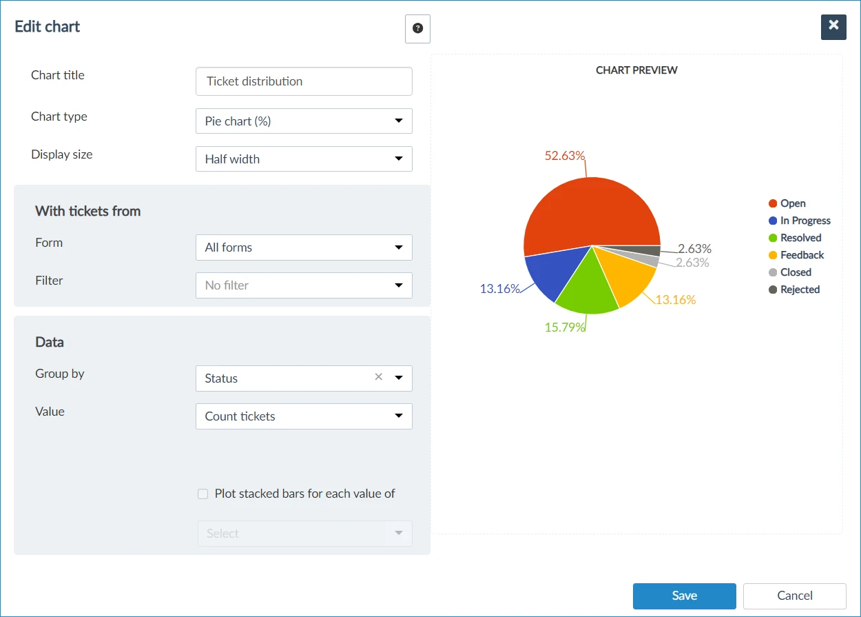
Charts are created for the entire PlanRadar account and can be viewed with data from one, multiple or all projects. Read more below in View Statistics.
Chart Types
The following chart types are available:
Pie Charts
Pie charts can either show the values in % or in absolute numbers. E.g. to show the number of tickets per status.

Bar Charts & Column Charts
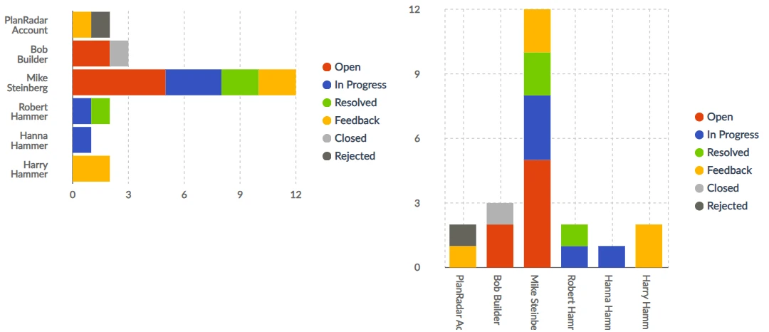
Bar charts (horizontal) and column charts (vertical) allow to show multiple dimensions. e.g. to show the number of tickets per status and per assignee.
Line Charts
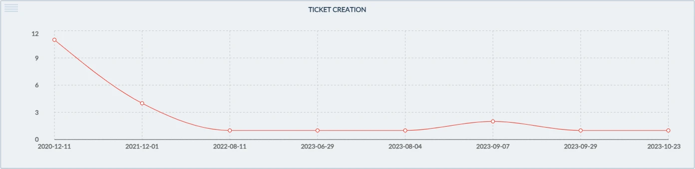
Line charts can be used to illustrate ticket data on a continuous scale, such as numerical values or dates. For instance, they can display the volume of tickets generated over a specific date range:
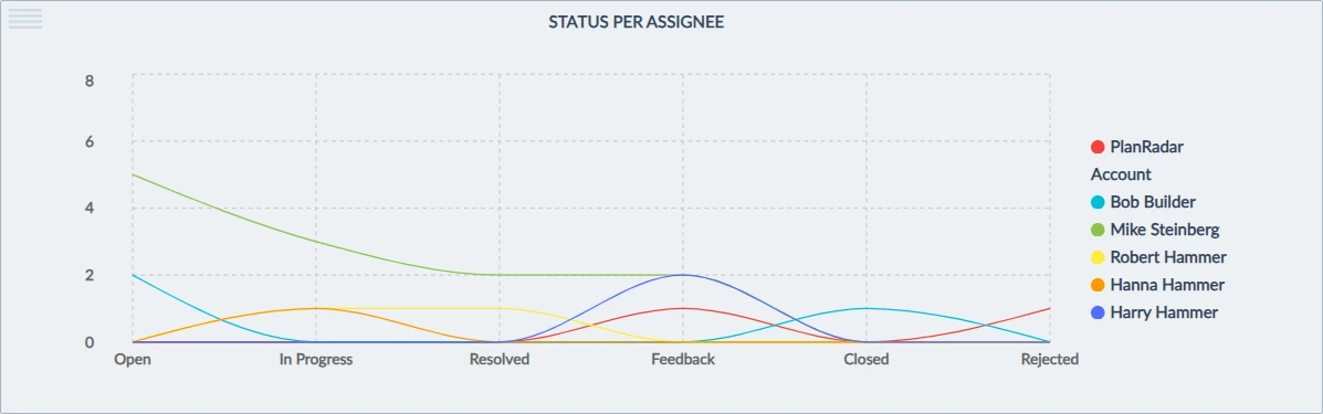
Line charts can also show multiple dimensions. e.g. to show the number of tickets per status and per assignee.
Ticket Form & Filters
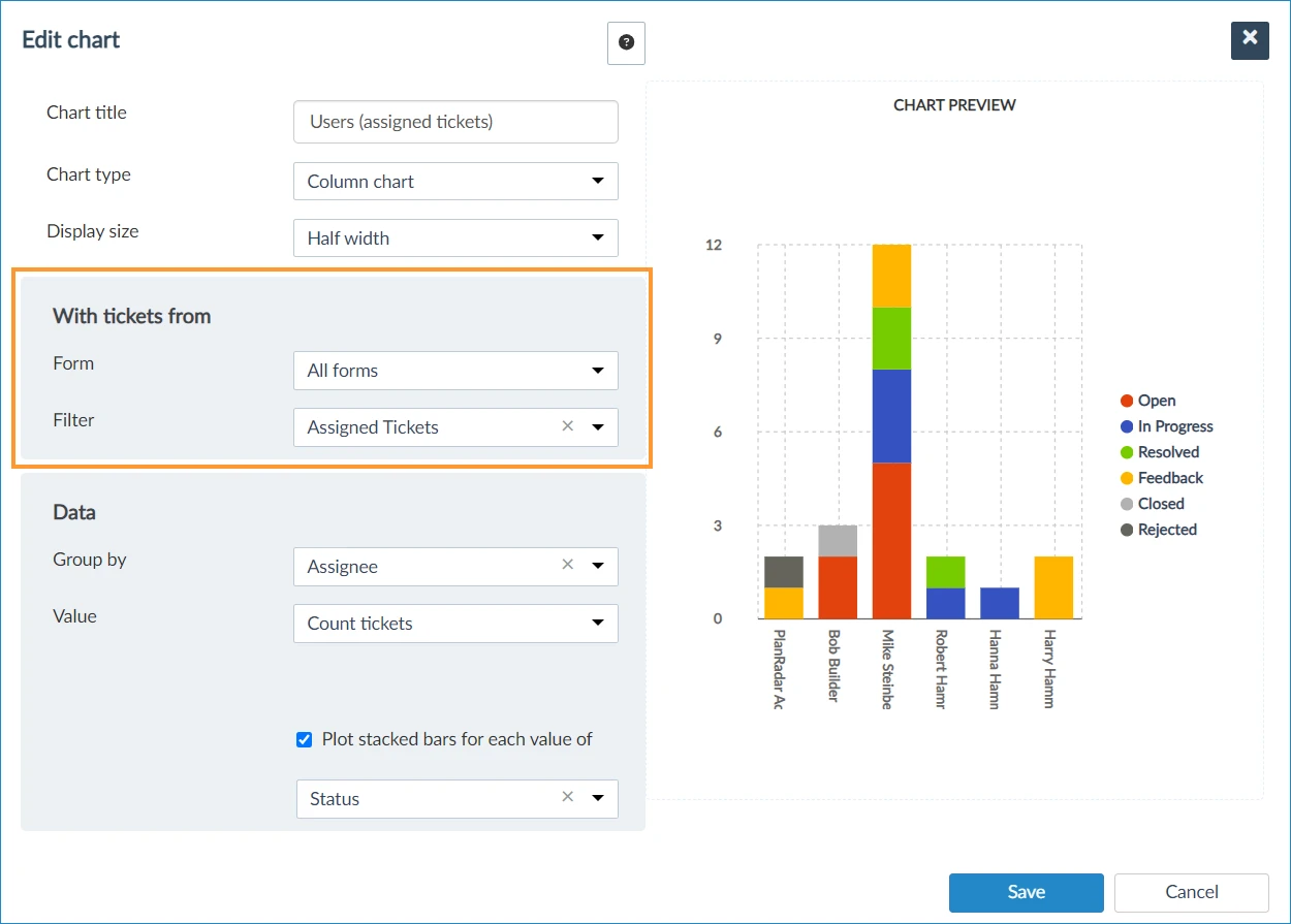
Charts can be limited to tickets of a certain form or based on tickets from 'All forms'.
In addition you can apply a filter. e.g. to show only data from tickets that have an assignee set.
Ticket Data
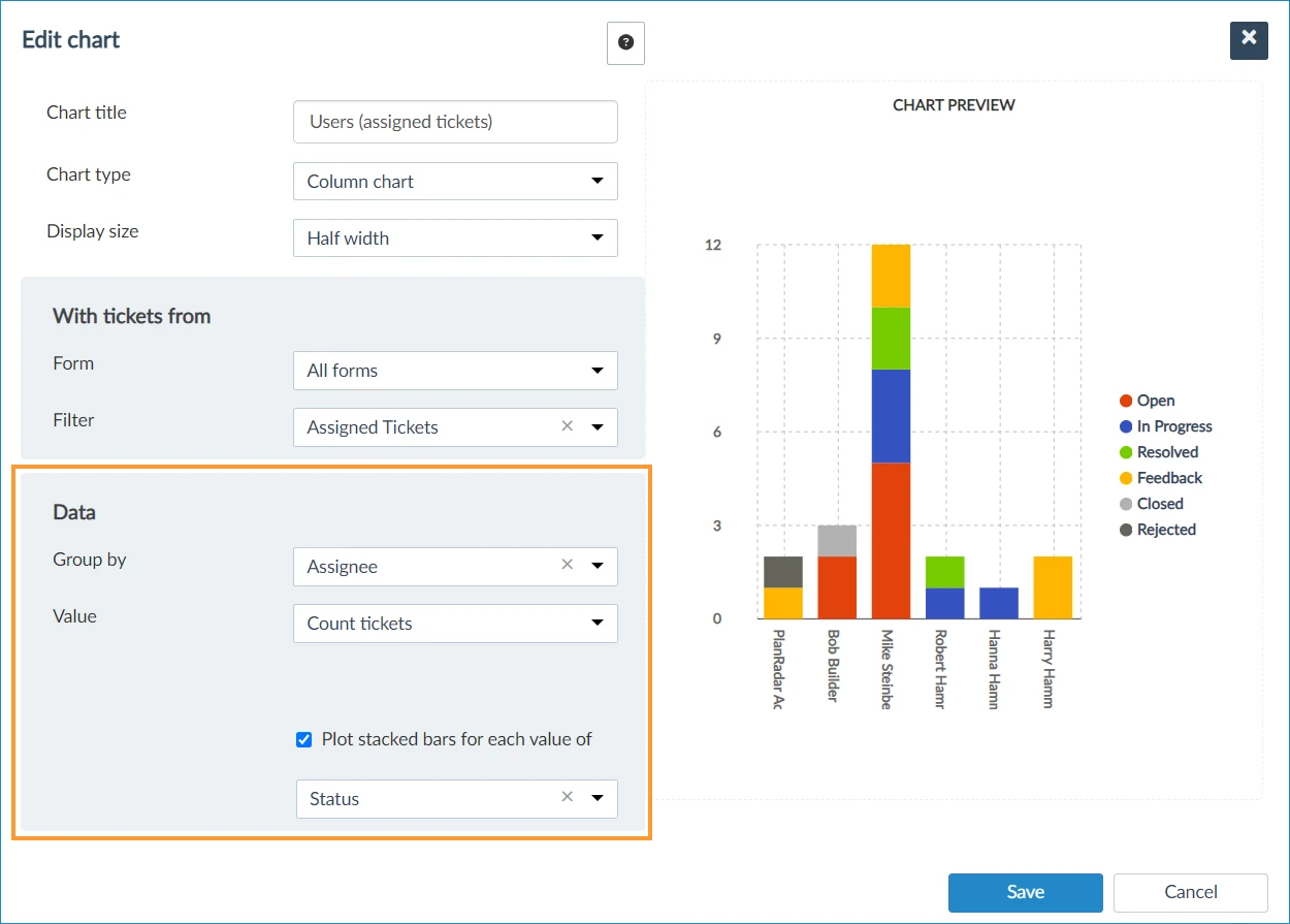
'Group by' defines from which ticket field the data is calculated (e.g. grouping by 'Status' means that for each status a value is calculated in the chart).
'Value' defines the function to be applied to this data, e.g. 'Ticket count'.
For number and decimal fields you can run the following calculations in addition to counting tickets:
- sum
- mean average
- min/max
It is possible to select a different field for calculations, but usually you will choose the same field like in group by.
Also see Editing and Deleting Charts.
View Statistics
Select a project, layer, time period or filter to apply to all your charts at once.
Add Charts to Ticket Reports
Each chart can be added to ticket reports.
Export Statistics to Excel
All the charts of a board can get exported to an Excel file.
Updated May 24, 2026